Categories
Arts & Letters

Dream House Renovation

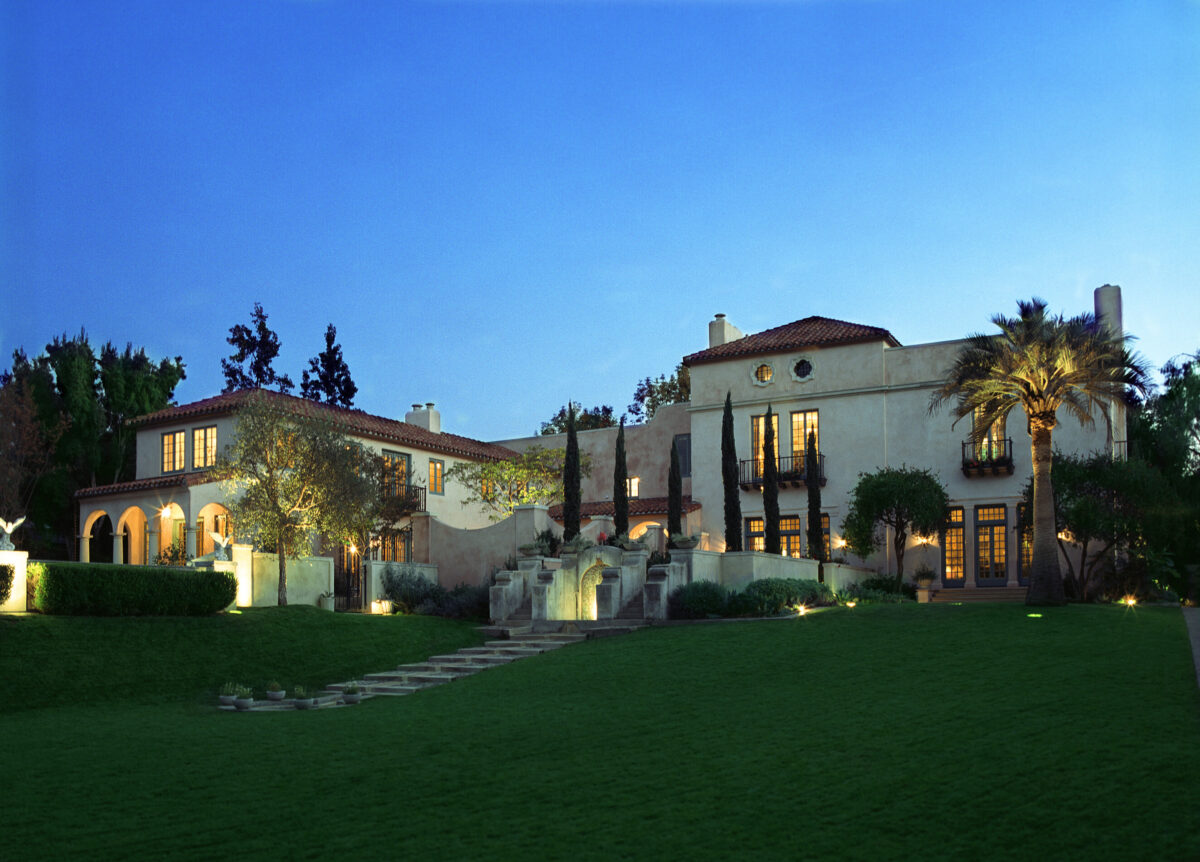
The team at Evens Architects faced a real challenge when they were tasked with restoring the house known as “Mi Sueño,” or Spanish for “My Dream.” It was a reinterpretation of Spanish Baroque and Spanish Colonial architecture, conceived by famed architect Bertram Goodhue while he was lead designer for the 1915 Panama–California Exposition. That event was to celebrate the opening of the Panama Canal.

When Evens Architects first encountered the property in 1998 in the Pasadena Arroyo, they found that decades of deferred maintenance and insensitive remodeling had left the once-proud house in poor shape. The task confronting the design team—to restore the remaining fragments of Mi Sueño to their former glory while accommodating the lifestyle of the new homeowners—was daunting.

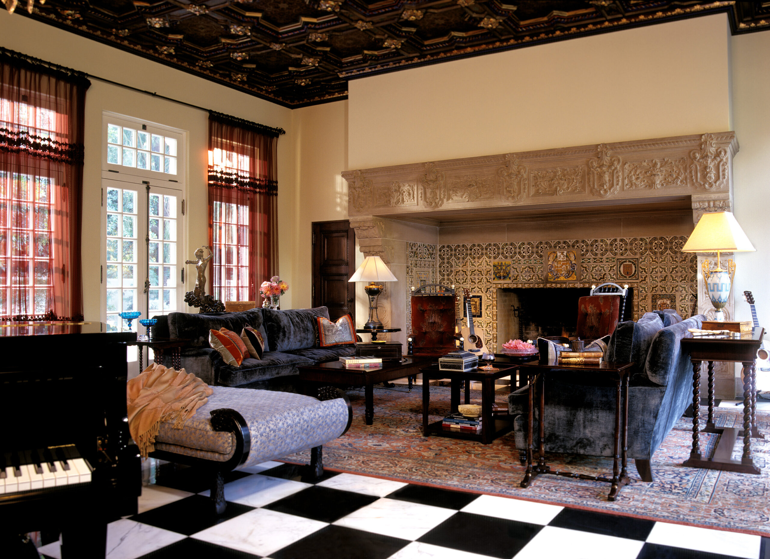
The completed renovation in 2004 turned out to be a true rebirth. The existing magnificent living room, with its lushly detailed, coffered ceiling of Moorish design, was restored to its original condition. Exuberant landscaping now envelops the home, providing a variety of inviting outdoor spaces. Meanwhile, the completely reimagined master suite, with elaborate hand-cut Moroccan tile mosaics and a canopy bath, evokes a dream-like scenery.
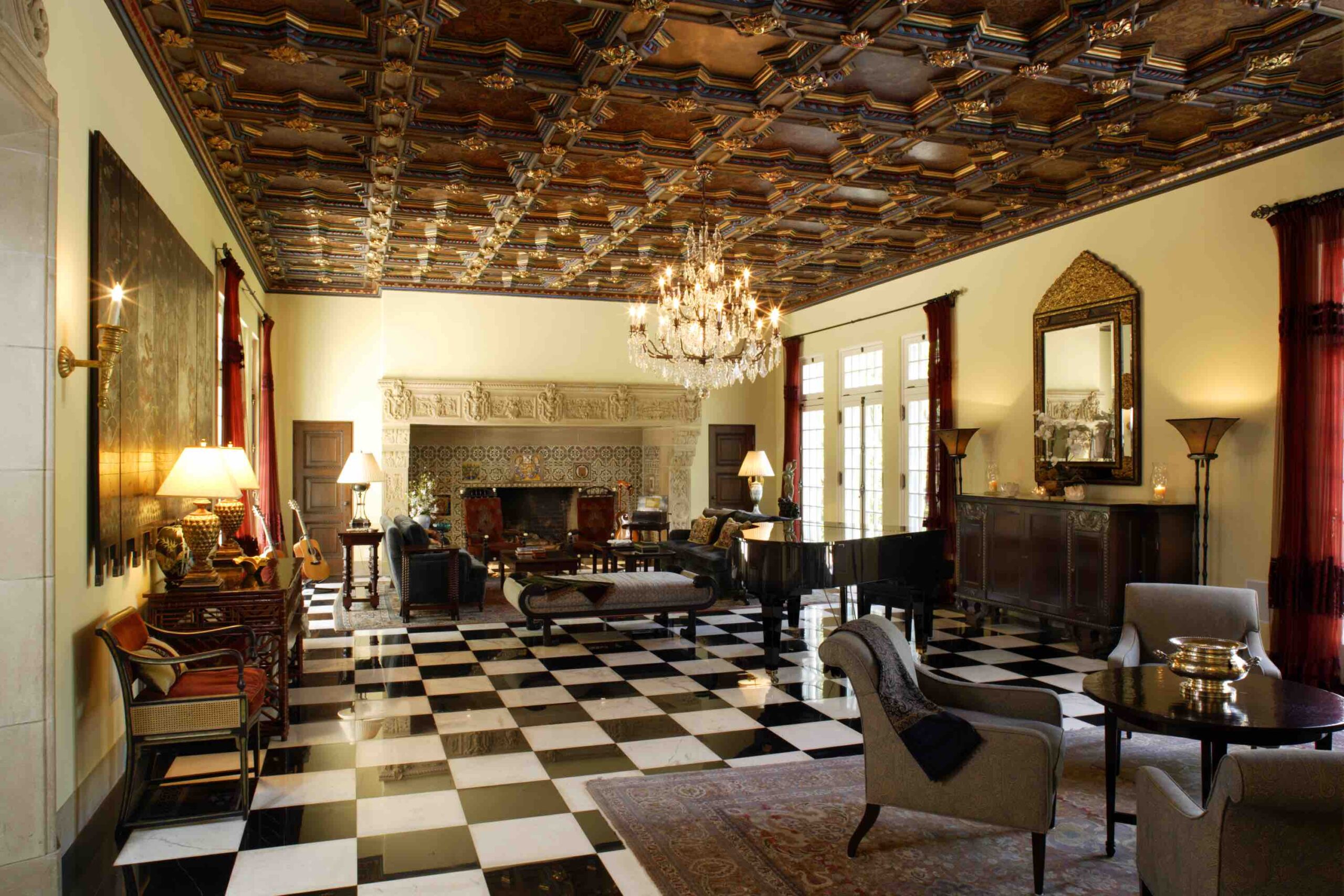
The coffered living room. (Erhard Pfeiffer)
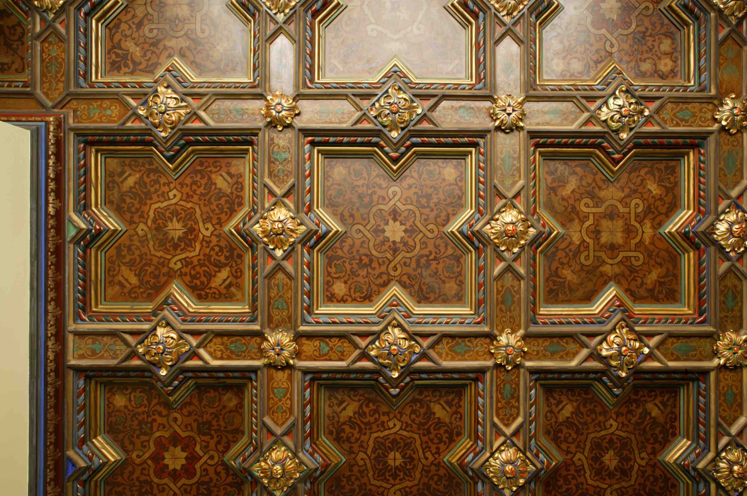
Detail of the coffered ceiling design. (Erhard Pfeiffer)
Another view of the living room. (Philip Clayton Thompson)

Mi Sueño was constructed in 1915. Originally designed as a residence for a banker from New Jersey named Herbert Coppell, the estate comprised several acres. As the estate changed hands over the years, most of it was sold off. In the 1940s, the house itself was divided into two parts, with one fragment becoming a separate house on the property immediately to the south—which still exists. The northern fragment, which included the living room, became Mi Sueño.

The original parts of the house that were still of great quality and worthy of restoration included the living room and the entry hall, which featured original cast-plaster detailing designed by Goodhue, according to Erik Evens, partner at Evens Architects, a Los Angeles-based firm that’s part of KAA Design Group. The rest of the spaces had been poorly remodeled over the years and had to be reinvented.
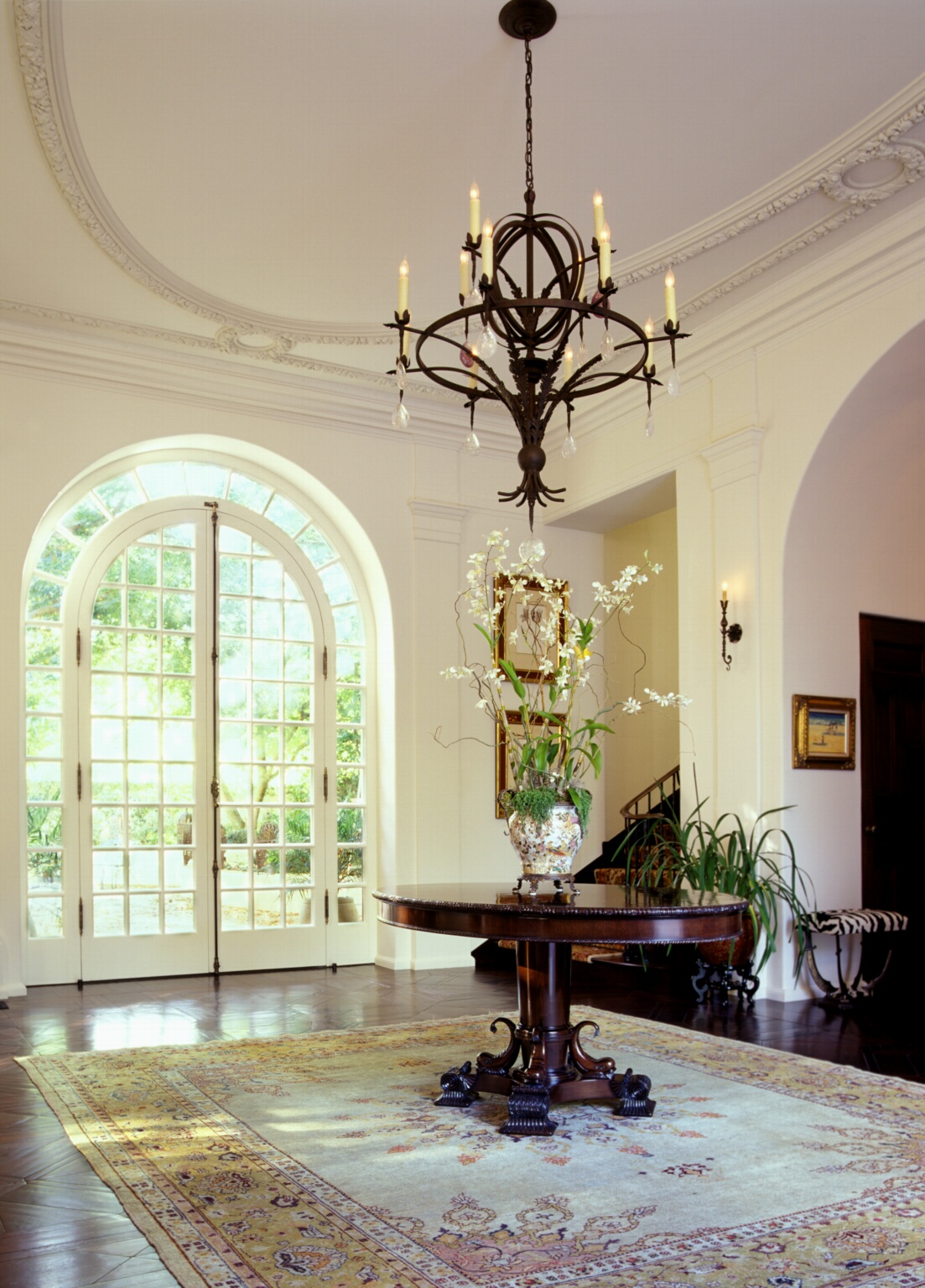
The entry hall with ornate plasterwork. (Philip Clayton Thompson)

Evens said the most challenging part of the renovation was rectifying the structural deficiencies of the house. The walls were constructed of hollow clay tile, which was a common building material in 1915 but is no longer used today, and for good reason. “Although strong in compression, the clay bricks are quite brittle and not able to resist the earthquake loads we have in southern California. They simply would not be approvable under current building codes. So for the entire northeast wing of the house, we had to demolish the exterior layer of clay tile bricks and build a concrete shell around the house,” he said in an email interview.
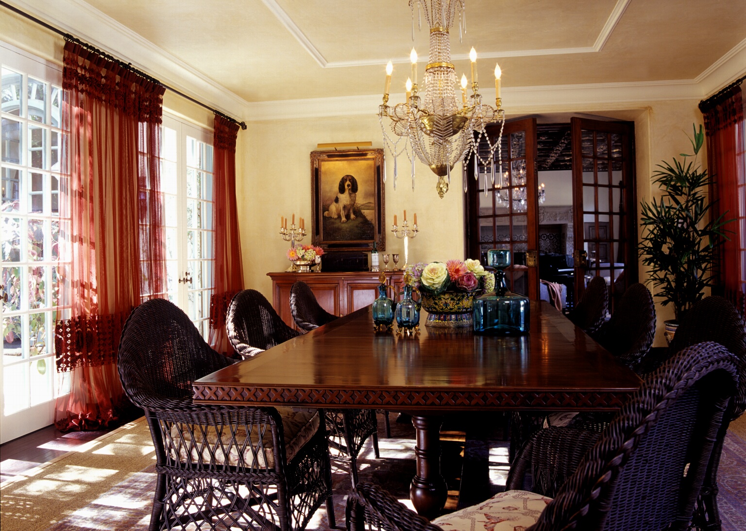
The dining room. (Philip Clayton Thompson)
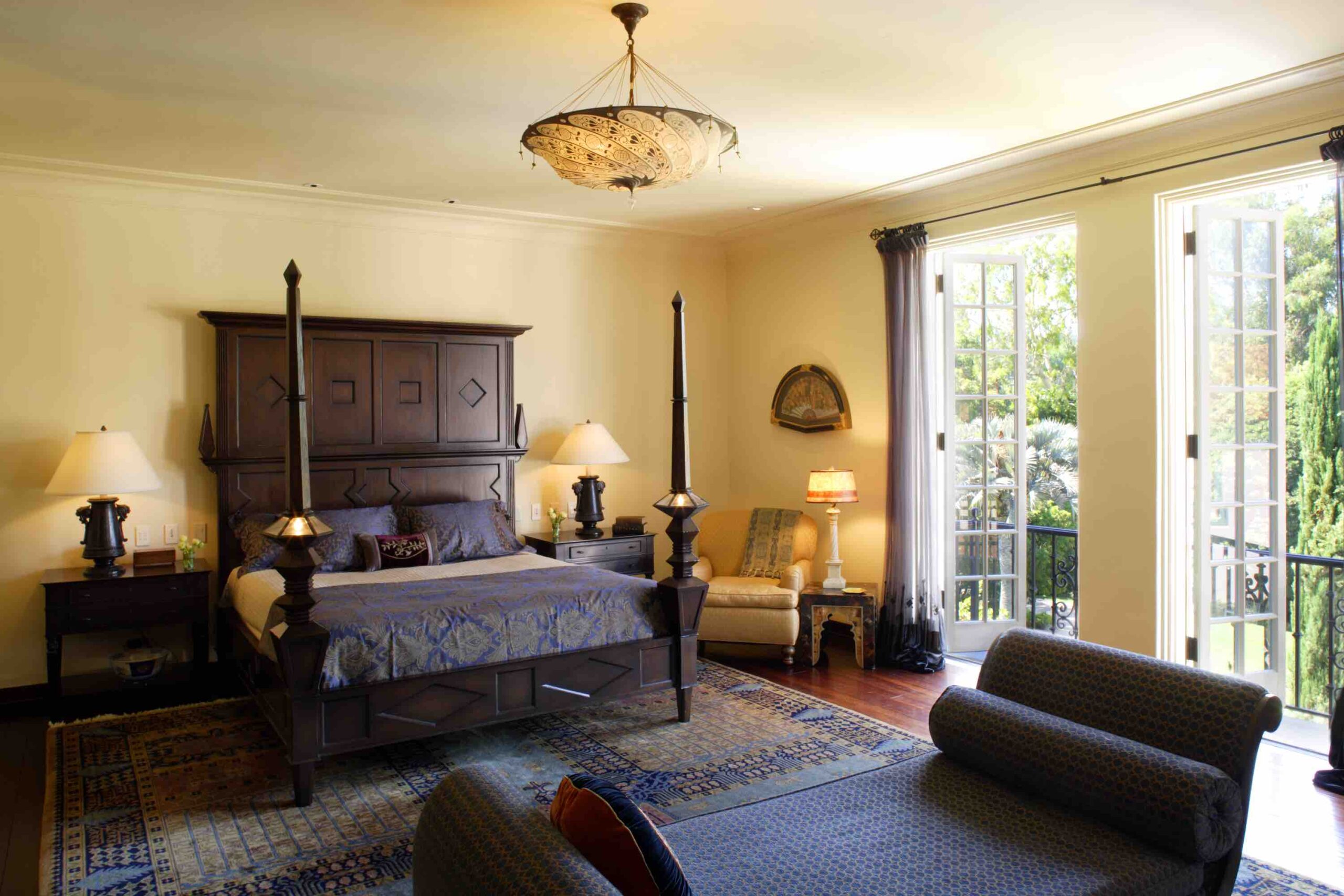
The master bedroom. (Erhard Pfeiffer)

The original house included many details and motifs derived from the Moors, who left a lasting impact on art and culture in the Iberian Peninsula after centuries of conquest. Most notably, the Moorish influence is evident in the star detailing in the magnificent, coffered ceiling of the living room.

“We used this as an inspiration to develop the new spaces of the house,” Evens said. “Our clients requested a large and luxurious master bathroom, so we reworked one of the existing secondary bedrooms into a Moorish fantasy bath, complete with hooded canopy tub and exotic Moorish cut tile mosaics on the walls. The Alhambra in Spain was certainly an inspiration,” referring to the majestic palace complex in Granada.
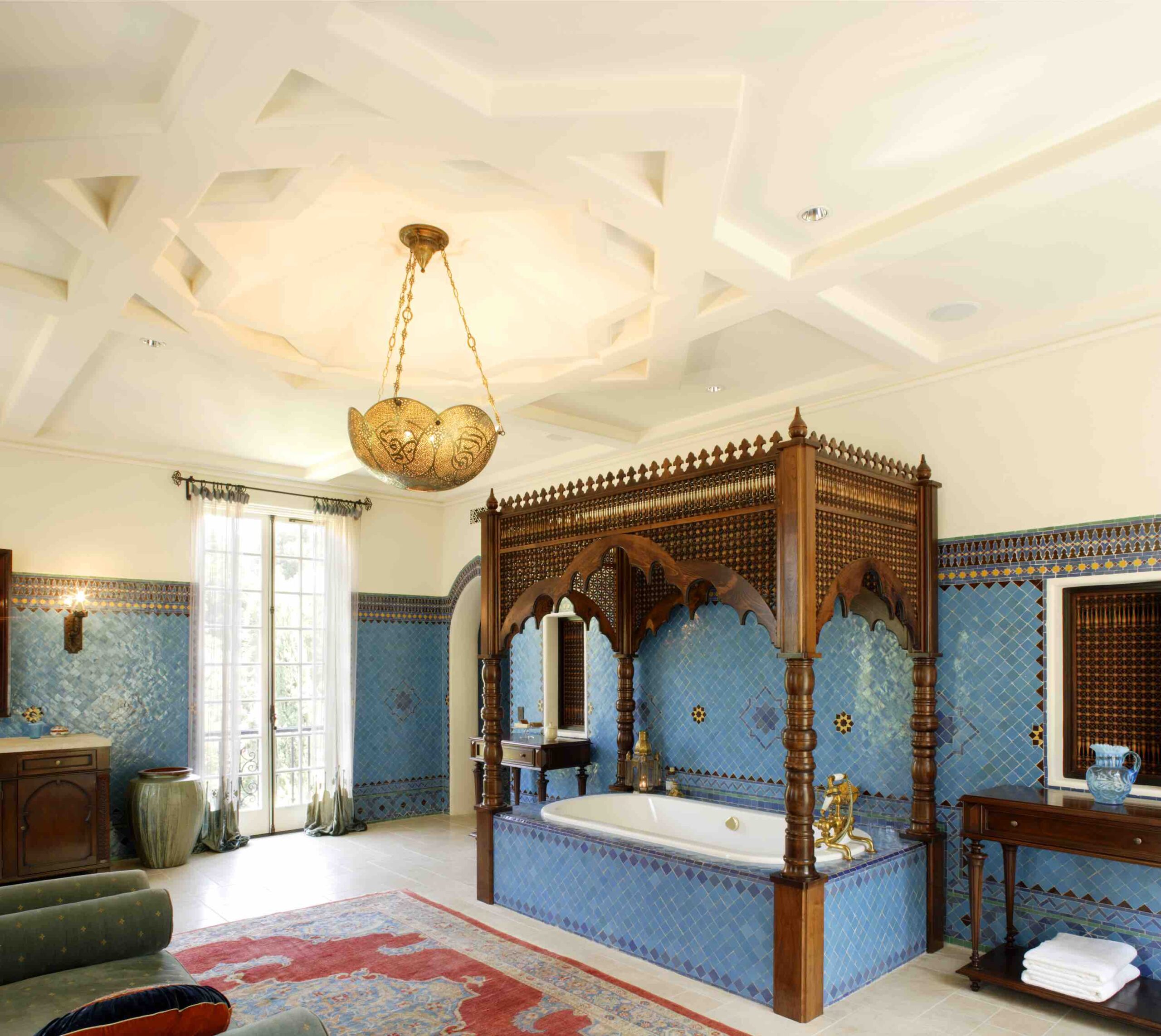
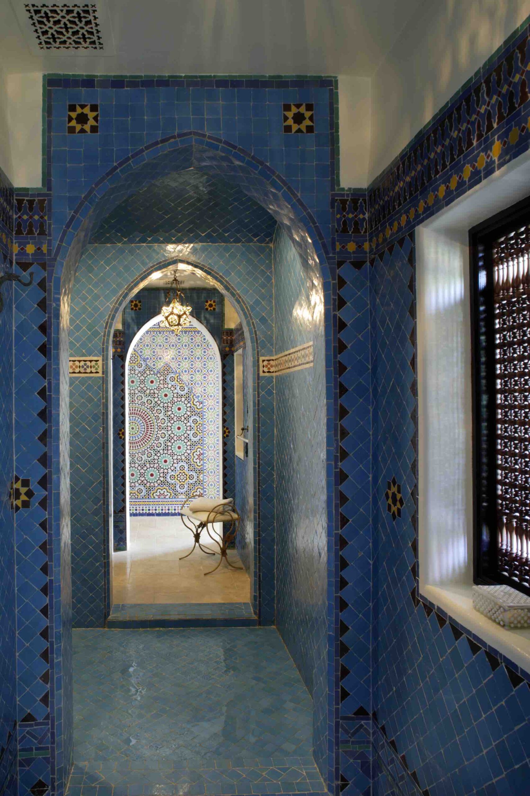
The master suite bathroom. (Erhard Pfeiffer)
(Erhard Pfeiffer)

The mosaics were created by Mosaic House in New York City. Their installation required collaboration between Evens Architects, Mosaic House, and the interior designer, Chris Barrett. Constructed onsite using traditional methods, the mosaics were laid upside-down on a leveled bed of moist sand. Each piece was hand-cut. Once all the pieces were in place, a thin bed of mortar was poured over the back of the tiles. Once that was cured, the panels were tilted up and installed on the walls.

“It was an amazing process!” Evens said, as bathrooms were constructed very differently back in 1915.

The team also created a modern family kitchen, and gutted the northeast wing of the house “to create a new, cozy family room, which opens to the main courtyard through broad French doors,” Evens said.

This restoration was a good fit for Evens Architects, as the firm is committed to the idea that architecture inspired by classic traditions—whether the sources are Spanish, Italian, French, or Moroccan—is well suited to the climate, landscape, and culture of contemporary California.
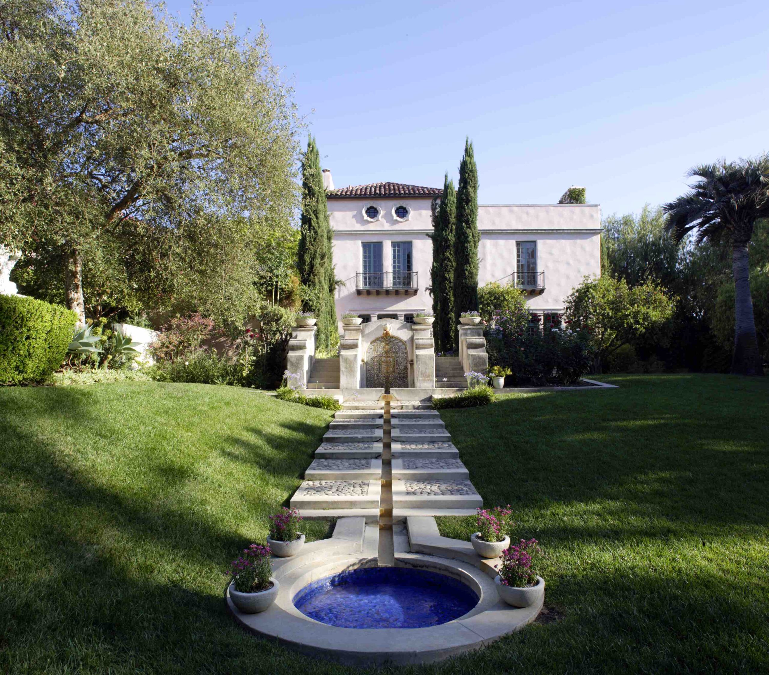
The courtyard, which features a fountain. (Erhard Pfeiffer)
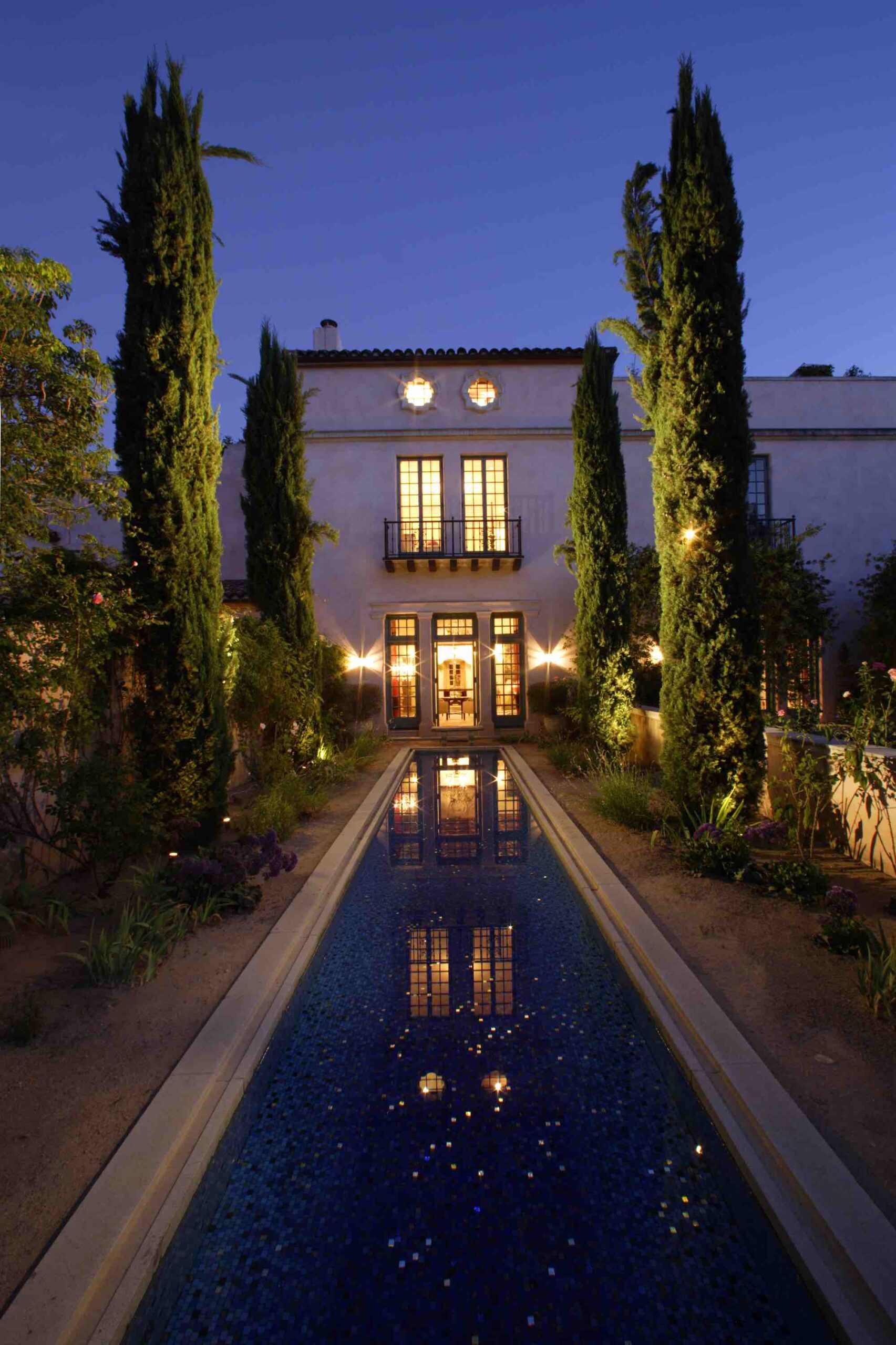
A reflecting pool on the other side of the house. (Erhard Pfeiffer)

Neal Lorenzi is a content guru and freelance writer who has contributed to a variety of publications. In his spare time, he likes to read, listen to music, and power walk.

Categories
History

The Capitol’s Statue of Freedom

As I step outside the House chamber on the second floor of the Capitol, I guide my visitors halfway down the stairs outside, offering them a sweeping view of the Supreme Court building and the Library of Congress. That’s when I call their attention to something else altogether—the crowning achievement, literally, of the Capitol: the Statue of Freedom, perched atop the dome, solitary, magisterial.

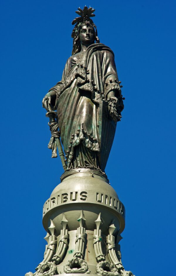
It is perhaps the most recognizable feature of the Capitol, an iconic world image of liberty and government by the people. Peering into the distance nearly 300 feet above the East Front Plaza, the bronze statue is of epic dimensions, soaring almost 20 feet high and weighing about 15,000 pounds. Freedom is decked out in an elaborate headdress topped by an eagle head and feathers. Her flowing dress is cinched with a large brooch emblazoned with two letters: U.S. In her right hand, she clasps a sheathed sword, while the other clutches a laurel wreath of victory and a shield.

The Statue of Freedom perched atop the Capitol is something to behold and serves as a symbol of my stewardship as a member of Congress, which is why I selected that image of the Capitol dome to adorn my letterhead. This is what I want my constituents to see, to be reminded of, when I write to them.

The Statue of Freedom also symbolizes the personal quest for freedom of one man, Philip Reid, born into slavery in Charleston, South Carolina, in 1820. In one of the great ironies of American history, Reid, as a slave, was assigned the complex project of creating and placing one of the world’s most powerful symbols of freedom on the most visible building in our nation.

The Statue of Freedom atop the U.S. Capitol dome in Washington, D.C., on July 1, 2010. (Paul J. Richards/AFP via Getty Images)

I’ll admit, I didn’t know the
 story of Reid until after I became
 a member of Congress and got the 
lowdown on the history of the Capitol from those in the know. But once I heard about Reid’s remarkable story, I delved deeper, reading more about it online. I mention all this about Reid during my tours, and though not one of my visitors has ever known the story beforehand, they are surely glad to hear it. Slavery is a terrible stain on our history, but my guests are palpably proud of how far America has come since then.

The statue was commissioned in 1855. Thomas Crawford, an American sculptor, created the plaster model of the statue in Rome, Italy. After his death in 1857, his widow shipped the statue in six crates, and the model was assembled and placed in what is now Statuary Hall. The following year, Clark Mills, a self-taught sculptor, was given the task of casting Freedom. Mills started his business in South Carolina, where he purchased Reid for $1,200. Reid dismantled the model in the Capitol, cast the individual sections, and finally assembled and mounted the bronze sections atop the dome.

On April 16, 1862, as Reid supervised the creation of the statute’s massive bronze sections, Congress passed the District of Columbia Emancipation Act, freeing thousands of slaves living within the district. That included Reid. As a free man, he kept working for Clark Mills. At noon, on December 2, 1863, under Reid’s supervision, the top section of the Statue of Freedom was raised and bolted on top of the Capitol dome.

Many of the experts with whom I have toured the Capitol offered various explanations for the direction the Statue of Freedom faces. Some say Freedom faces east because every morning she watches the sun rise on America with a new day of liberty for all. Others say she faces east because the primary entrance to the Capitol is on the east side, or because most residents of Washington, D.C., at the time lived on the east side. Yet others suggest she faces east because European settlers came from that direction.

The Statue of Freedom on top of the U.S. Capitol dome, silhouetted against the super moon on Jan. 20, 2019. (Brendan Smialowski AFP via Getty Images)

As the foreman in the casting of the Statue of Freedom, Philip Reid stepped in when an Italian sculptor hired to assemble the five sections refused unless granted a pay raise. It was Reid who figured out how the pieces were separated and put together. He was paid $1.25 a day, though his owner received those payments, except on Sundays, when it was his own. Mills, the man who bought Reid, described him as “short in stature, in good health, not prepossessing in appearance, but smart in mind.”

Reid was a freed man by the time the last piece of the Statue of Freedom was assembled in December 1863. He went on to become a respected businessman, identified in census records as a “plasterer.” While a plaque to Reid resides not at the Capitol, but where his remains lie at the National Harmony Memorial Park in Landover, Maryland, his place in history—and on my tour—remains resolute.

Excerpted from the 2020 book, “Capitol of Freedom: Restoring American Greatness,” by Colorado Rep. Ken Buck.

Categories
Features

Southern Hospitality

The American South has a reputation for its warm hospitality. This cultural feature has even influenced the way houses are decorated and built in the region.

Susan Sully has written several books about Southern architecture and design, highlighting the design principles and traditions that give the region’s aesthetic its distinctly unique identity—a “Southern style anthropologist” of sorts, as she describes herself.

The culture of hospitality has led to a local emphasis on making one’s home comfortable and welcoming.

Remembering the Past

Sully explained that before the advent of modern transportation, people spent a lot of time on the road. “They would sometimes just have to stop at a stranger’s house and at least ask for water, and sometimes ask for a place to spend the night. So there was this sort of readiness of providing hospitality to the stranger.”

(Courtesy of Susan Sully)

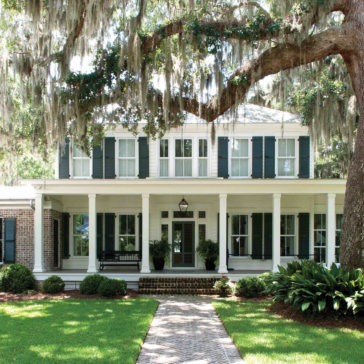
Southerners have thus adopted a real affinity for welcoming guests to their house. “Southerners are social. They’re more garrulous. And in a way, when you think of a Southern house, with the porch on front, it’s like the house is almost reaching out towards you…So I think, architecturally, the Southern house speaks about that friendliness,” Sully explained.

The hot, humid climate also played a hand in the emphasis on socializing: people would cool off by sitting on their porches, relaxing, and chatting for hours on end.

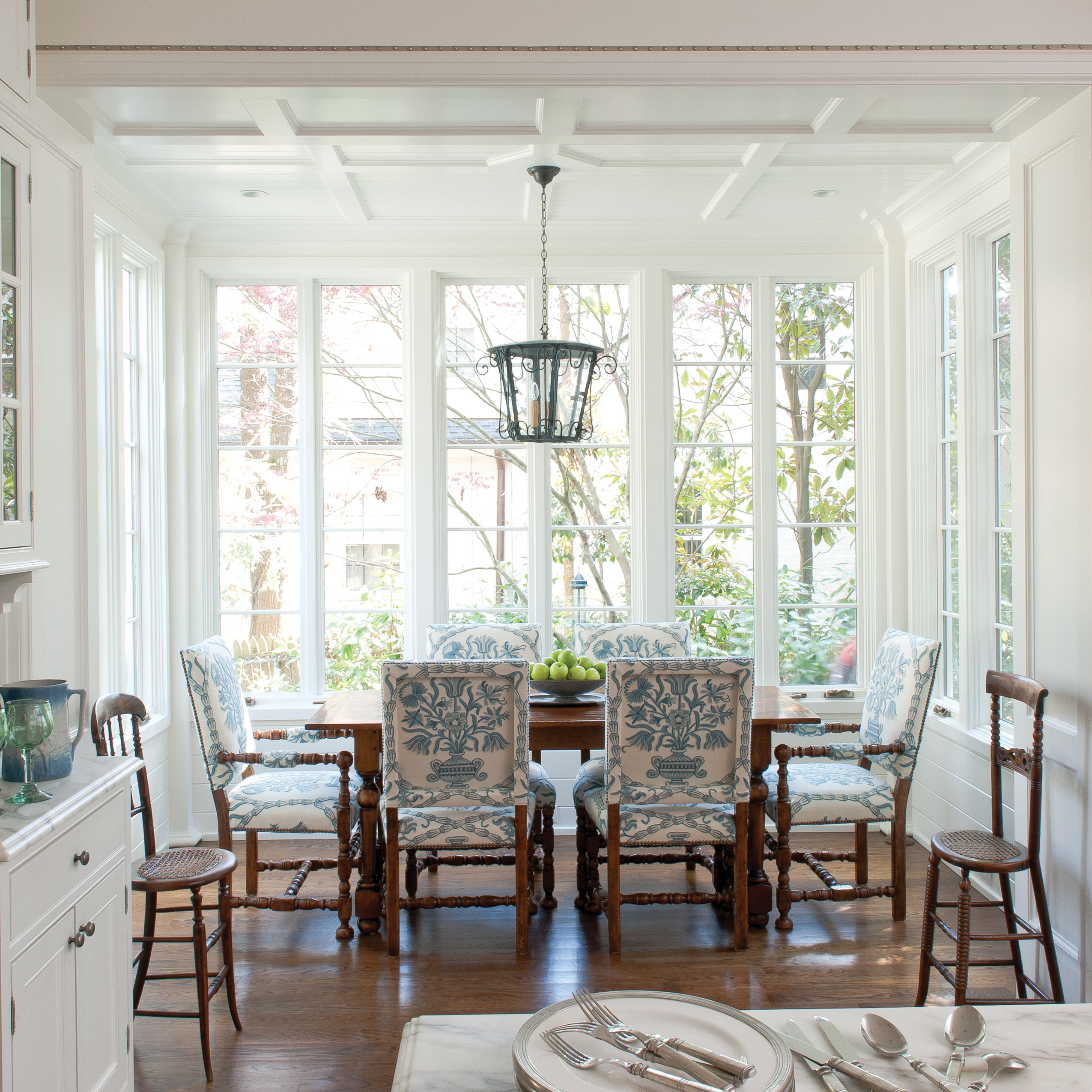
Southern homes also tend to have elaborately-decorated sitting and dining rooms. “They have a little bit of a ceremonial quality…so that, you’re really saying, ‘Hey, we’ve made this really special for you, because we’re glad that you’re here.’” At the same time, the furnishings would be comfortable, so that guests are encouraged to stay a while.

(Courtesy of Susan Sully)

Entrance halls are also important, as it is the first thing a visitor sees upon entering. “If they enter a place that kind of instantly engages them with something interesting, that’s more welcoming than something that just hasn’t really been thought about, or it’s kind of bland,” Sully said.

Above all, Southerners have a real nostalgia for the past. This, too, has roots in history.

Prior to the Civil War, the region was home to many wealthy aristocrats who bought the latest wares and beautiful things. But after the devastating conflict, “they couldn’t afford the best anymore. So they really hung on to what they had. Part of that was just a way of holding on to memories of your forebears,” as well as a way of life that was lost, Sully said.

The South’s strong sense of family tradition is also reflected in people’s preference for using heirloom furnishings. “There really is…a deep sense of fondness…for using your grandmother’s things and using it to tell stories. Southerners love to tell stories, and they love to have their houses full of things that tell stories.”

Decorating with Antiques

If you have inherited antique pieces, Sully suggests using them to add meaning and character to your living space. For example, Sully places a large 1936 unabridged Webster dictionary that she inherited from her grandmother in her living room. Her grandmother was a librarian.

“It’s a connection to something that my family valued, which is language,” she added.

Antiques can easily be incorporated into the home as accent pieces. The key to preventing the look from veering old-fashioned or kitschy is to offer contrast. For example, a French Louis XVI chair, with its curvaceous shape, can complement modern furniture pieces that have simpler silhouettes or straight lines.

(Courtesy of Susan Sully)

Sully also suggests reupholstering antique furniture with a bolder color that you don’t usually associate with the time period. If it is not a fine piece, you can also paint it a new color or apply a high gloss.

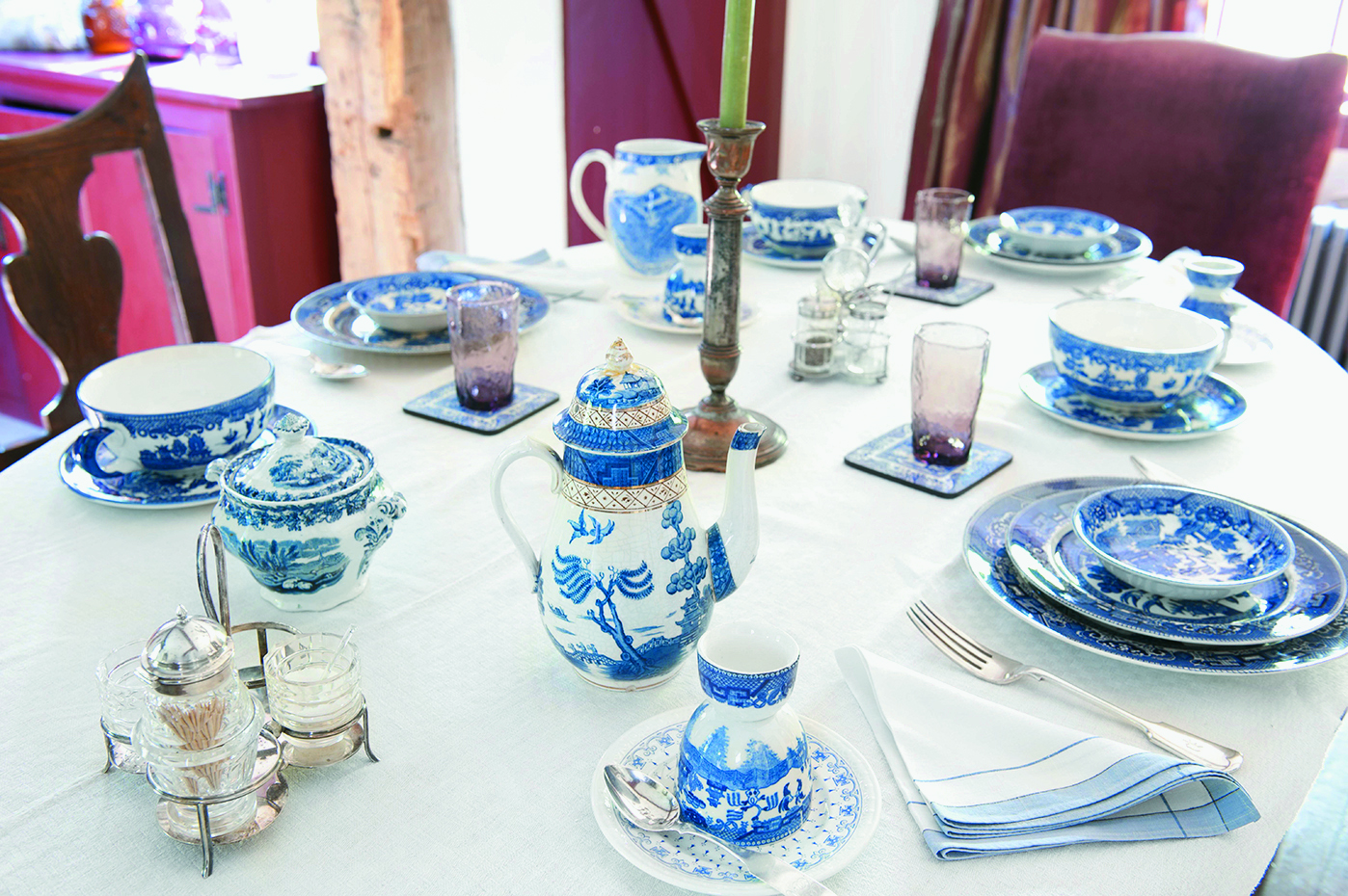
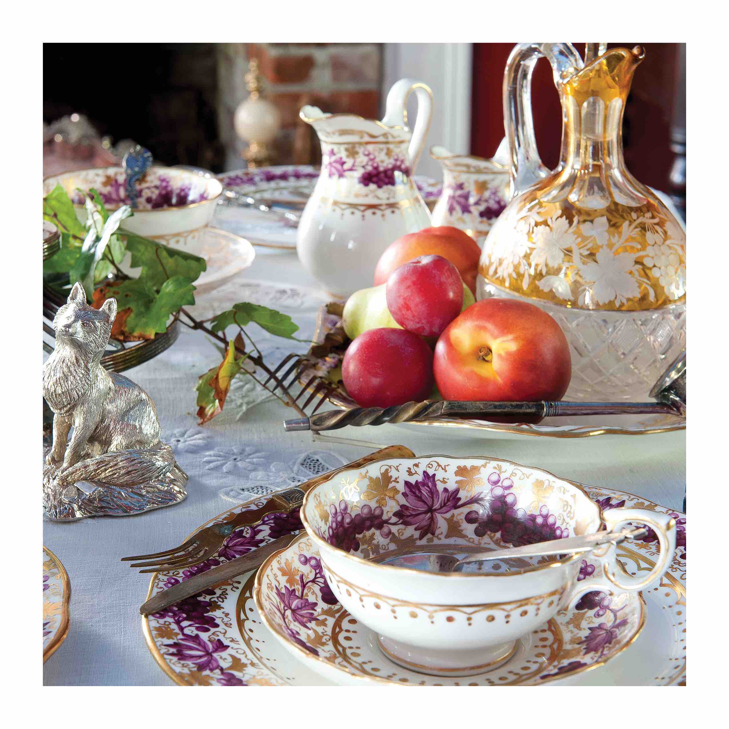
Antique tableware can also be repurposed for everyday use. For example, instead of using silver cups or teacups as formal china, they can become flower vases.

For those who are new to antiques, Sully recommends going to antique stores and flea markets, or flipping through auction catalogs to see what you gravitate toward. That would be more personal and “lasting” than collecting something old at random, Sully said.

Categories
Features

Temples of Transportation

In 1862, arguably one of the darkest and most uncertain years for our republic, President Abraham Lincoln pressed Congress to pass the Pacific Railway Act. As North and South were being ripped apart, Lincoln, a former railroad attorney, sought to use the rails to tie East and West together.

America was still involved in the process of recovering from her terrible civil war, when on May 10, 1869, the Transcontinental Railroad was celebrated as complete. The railroad had been constructed in a mad dash, as the two competing lines, Union Pacific and Central Pacific, raced to complete as much track as possible. The prize, 6,400 acres of land and $16,000 for every mile of track completed, led to a spirited competition. Union Pacific’s Thomas Durant and Central Pacific’s Leland Stanford pushed their crews on. When they met in Utah, they kept on pushing right past each other.

In a photo of a trestle by Andrew J. Russell, the bridge itself is built of fresh cut timbers—quite a contrast from Benjamin Henry Latrobe II’s beautiful railroad viaducts. This photo reveals another graded right-of-way beside the completed track, bearing witness to the competition between the two companies.

The next few decades saw the nation steadily crisscrossed with railways, as communities and permanent infrastructure replaced the rolling “hell on wheels” camps of railroad workers. As the 19th century drew to a close, railroads became the primary connection between great cities, and the various companies sought to show their importance by building grand terminals. Their desire for architectural significance would create grand entrances to the cities they served.

Of course, the great classical forms of the 1893 World’s Fair would inspire many of them. Washington, D.C., as a result of the McMillan plan for the Washington Mall, built a grand station, “monumental in character,” designed by Daniel Burnham and William Pierce Anderson. Burnham had planned the great Chicago Columbian Exposition of 1893, and for the Washington station, he chose a mixture of classical motifs. This station replaced a hodgepodge of railroad connections through Washington, placing tracks in tunnels and freeing the National Mall to become a grand avenue.


Burnham would also design the Pennsylvania Union Station for the growing manufacturing center of Pittsburgh, with its distinctive rotunda. It seems that every prominent city sought a great entryway in the form of her railway stations. America’s great classicists would find many commissions as they fulfilled that mission.

Cornelius Vanderbilt’s New York Central Railroad built a monumental terminal in New York City, beginning in 1869. Designed by John B. Snook in the Second Empire Style, it would be expanded and eventually replaced in 1913, with the present Grand Central Station, designed by Charles A. Reed and Allen H. Stem. Reed & Stem were hired to build a station that would compete with another great station being built by McKim, Mead & White in that same city. That great railroad rivalry would lead to New York City having two great entryways.

At the beginning of the 20th century, there was only one great railway into Manhattan—the New York Central. Cornelius Vanderbilt owned Manhattan, or so it seemed. Though the Pennsylvania Railroad was actually bigger than the New York Central, it was not able to come into New York City. Pennsylvania Railroad trains only came to the shore of New Jersey, and passengers would then ride a ferry to the docks of New York.

However, Pennsylvania Railroad President Alexander Cassatt would make a fateful trip to France to visit his sister, Mary, the Impressionist painter. There he would see electric locomotives being used to pull trains through tunnels beneath the ground. A great plan formed in his mind! It was a plan for not just one tunnel, but a series of tunnels that would bring tracks across New York’s Tenderloin District and continue on to Long Island. There, the Pennsylvania would connect with the Long Island Railroad.

But there was more. Crossing the Hell Gate Bridge would enable trains to connect with New England railroads as well. It was a brilliant, daring, and dangerous plan. The Hudson River was a mile wide, and tunneling had to be done in pressurized caissons through the muddy bottom. Engineer William McAdoo began the construction of the first Hudson tunnel in 1902, continuing an earlier tunnel begun and abandoned in the 19th century. This tunnel was completed in 1908, as were tunnels to Long Island under the East River.

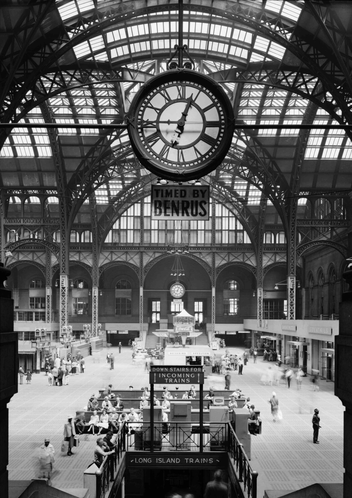
Having acquired a significant amount of real estate in Manhattan—needed for right-of-way—the Pennsylvania Railroad commissioned McKim, Mead & White to build the greatest entry into New York imaginable. The result was the magnificent Beaux Arts Pennsylvania Station. Not to be outdone, New York Central hired Reed & Stem to design the competing Grand Central Station.

McKim, Mead & White would also design the James A. Farley Post Office Building as a companion to the terminal. Though this terminal was demolished in 1966, the Farley Building, with its fine Corinthian columns, remains. Its Moynihan Train Hall now provides access to the tracks of what once was Pennsylvania Station.

Cities of all sizes would build fine stations. Richmond, Virginia’s Main Street Station is an example of Italian Renaissance influence. Completed in 1901, it was designed by Wilson, Harris & Richards. It features a fine campanile, and a series of arches topped by a steep hipped roof. In Staunton, Virginia, Thomas Jasper Collins would place a bungalow style roof over a series of arches to create a distinctive train station. Built for the most part by private companies, these fine depot buildings would provide a unique identity for each metropolis they served—entering into the fabric of the republic’s civic architecture.

Categories
Arts & Letters House of Beauty

House of Beauty: Colonial Revival Style

A series exploring America’s traditional architectural styles

In a series, master woodworker Brent Hull will introduce readers to the different architectural styles that were popularized throughout American history, explaining their significance and unique design features.

In the early 1920s, two men of great wealth were investing their time and money into large restoration and preservation projects. These two men, H. F. DuPont and John D. Rockefeller Jr., both heirs to great fortunes, felt a nostalgic and patriotic pull to the architecture and ideals of colonial America.

Many things were happening in the 1920s culturally. The United States was fresh out of World War I, a war that established the United States for the first time as a major world power. This newfound status caused Americans to reflect deeper on their history. Also, 1926 was the 150th year anniversary of America’s founding in 1776—a milestone many were eager to celebrate. It was a glorious time.

DuPont, in his fervor, began to collect historic rooms of all ages from across the country. Today, his collection, totaling over 175 rooms, is open to the public via a museum converted from his estate, called Winterthur. These rooms represent a tremendous cross-section of American style and taste from 1640 to 1860, from high-style Philadelphia mansions to simple New Hampshire taverns. They demonstrate a level of craft and skill that are amazing, considering that there were no power tools or Pinterest boards for inspiration at the time.

hampton room
The Hampton Room in the Winterthur museum. It was used as a guest room for DuPont’s visiting friends. (Courtesy of Brent Hull)

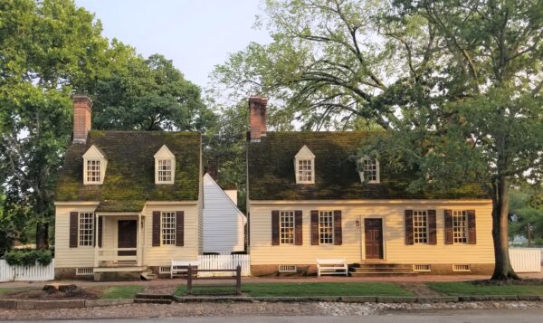
Meanwhile, Rockefeller poured his focus into rebuilding the early capital of Williamsburg, Virginia. Colonial Williamsburg, as it is known today, is a national treasure. I was there a couple of years ago on a sketching tour and was blown away by the charming and beautiful architecture. These buildings stand with a wonderful confidence. There’s no attempt to be showy, but rather, with humble elements and simple decoration, these buildings inspire.

It’s been nearly 100 years since DuPont and Rockefeller invested in and were enraptured by the Colonial Revival style. The Colonial Revival era spans from 1920 to 1940, an architectural style that takes the best of Georgian and Federal-era homes and blends them into a successful aggregate. When strolling through the cobblestoned streets of Colonial Williamsburg or the halls of Winterthur, it’s hard not to long again for the wonderful detail and simple beauty of these homes and rooms. Unfortunately, we can’t seem to build homes with the same level of execution, and our faster and cheaper homes appear disposable and no longer timeless.

colonial williamsburg
Colonial Revival-style houses in Williamsburg. (Brent Hull)

I was consulting with a client recently who was building a new home and had hoped to capture the spirit of her 1920s neighborhood. She shared her current plans with me and wondered what was missing. They had attempted to capture the past but had missed. “What is it about these houses?” she asked me. Why are we not able to capture it today in our home? I find this is a common sentiment among homeowners, and yet there is a fix.

When my company builds period houses, we’re focused on authentic details and subtle elements. Sometimes doing less is more impactful. It requires breaking habits of the last 50 years of building.

In truth, there are dozens of important decisions that need to be made when building a house. However, these decisions are much easier to make if you have a clear focus of what you’re building. I often ask our clients, is this home from 1760, 1820, or 1850? I’m asking for specific dates because that will help determine the styling, the hardware, the moldings, and a myriad of other details.

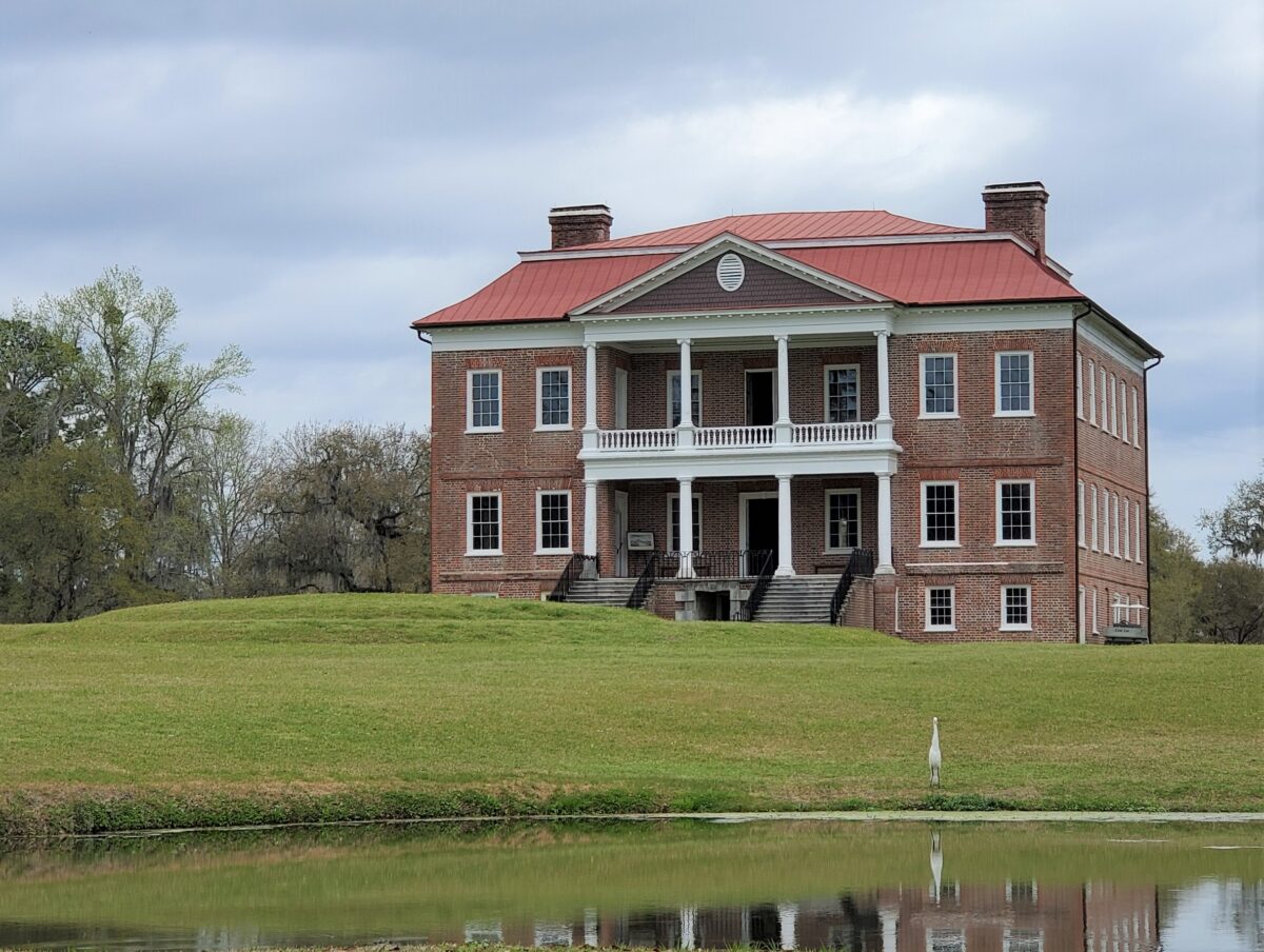
A recent home we built was inspired by Drayton Hall, the great Southern home built outside of Charleston, South Carolina in the 1740s. By tethering our client’s house to this historic home, we were able to determine many details such as the brick, the windows, the entryway, and the aesthetic of the home. There was no intention of a direct copy, but rather a desire to capture the spirit of this home and its authentic details.

Attention to historical detail allowed us to enliven the character of the home:

The windows are scaled and sized very carefully. Windows are the eyes of the home and the most important element to get right. We used graduated fenestration (the arrangement, proportioning, and design of windows and doors in a building) here, meaning the first floor windows are slightly bigger than second-floor windows. This establishes hierarchy and helps proportion the home with a heavier base and a lighter top.

Historically, houses made from brick were solid masonry, meaning the exterior walls were made of bricks two to three layers thick. The layers were tied together with bonding bricks, meaning bricks that tied the layers together. The layers were essentially woven together, unlike today, where the brick is a single layer or veneer in front of a wood framing. On our client’s house, we used this historic knowledge and introduced a historical bonding pattern. This means that every 5th course was laid up with header bricks. This breaks up the running bond of the brick face (brick that faces the outside world) by creating a subtle coursing pattern.

We also made sure the windows and doors were capped with a brick arch. A brick arch is a historic structural trick that physically spans an opening. While today, a steel lintel is used, historically the brick arch kept the brick above from collapsing. True brick arches are rare today and require a custom order from the brick manufacturer.

Louvers (window shutters with horizontal slats) used to be a working part of home air circulation systems. Closed in the morning to block sun and heat, they would be opened to allow light and air movement. With the arrival of air conditioning in the 1950s, windows gradually become non-operable, and large picture windows were introduced. Shutters were turned into a decorative feature, and on many homes, they’re screwed or nailed to the wall. Working shutters is a small thing that makes a big difference, because the authentic hardware and shadow lines add depth to the face of the home.

These are just a few of the examples of what makes for charming Colonial Revival homes. Remembering and practicing these historic building elements makes for a more beautiful home. In order to build great Colonial Revival homes today, we must be students of the past. We live in an age where the art of building has been lost. With careful work and attention to details, we can build better again.

Brent Hull is the owner and founder of Hull Works, a workshop dedicated to building period millwork, crafting houses, and restoring historic buildings. He consults and works all over the country. To continue studying traditional building practices, follow Brent on his Instagram @hullmillwork_hullhomes, his YouTube page, or www.BuildShowNetwork.com/go/brenthull.

Categories
Arts & Letters

Preserving the Nation’s Heritage, One House at a Time

If walls could talk, what stories would they tell?

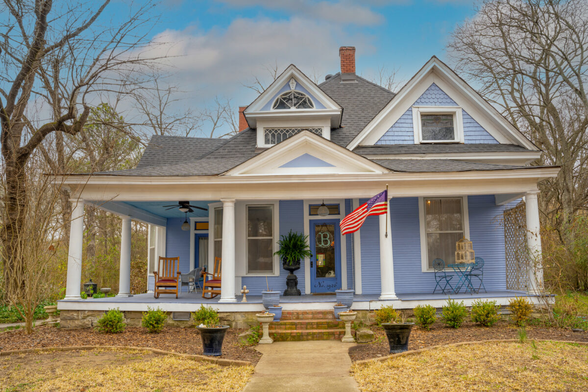
During the Civil War, Union soldiers occupied the region of Helena, Arkansas. They quartered inside a Greek Revival-style home that belonged to a local Confederate soldier. It was a stately mansion built in 1858, with a robust pediment and tall, elegant columns on its facade. Union Gen. William Sherman is said to have stayed in the home while planning his battles.

When the house went up for sale, Laine and Kevin Berry—avid lovers of old houses with history and fine craftsmanship—couldn’t resist.

When the couple first viewed the house, they were stunned. Etched glass panels glimmered in the dining room’s double doors, depicting two Biblical figures, Ruth and Naomi, standing on pedestals and surrounded by ornate leaf patterns.

laine and kevin berry
Laine and Kevin in their home. Laine is a bridal gown designer and operates a local salon, while Kevin owns an advertising and marketing business. (Sam)

Later, the couple went looking through the home’s records and discovered that Laine has ancestry in common with its previous owners. The papers list the name of Laine’s five times great uncle.

In a way, as Laine explains in a video on the couple’s YouTube channel, Our Restoration Nation, it was like she was returning to a family home.

Preserving History

The couple has taken on a number of ambitious projects—houses that have completely rotten foundations or electrical wiring held together by duct tape—that most wouldn’t consider worth salvaging.

They began buying and rehabilitating old houses across the southern United States about 20 years ago. Laine said that she and Kevin, spurred on by a passion for history and fine architecture, “both felt like the best way to preserve some of our nation’s heritage was to tackle these wonderful historic structures.”

For the couple, the homes are a reflection of American culture. “Preserving them helps not only preserve our culture, but it helps educate people—to understand where we’ve come from and what got us to where we are today,” Laine said.

historic house
The interiors incorporate many antique items for a time-worn feel. (David Hatfield)

About a year ago, they started documenting their projects on YouTube, with practical tutorials on topics ranging from how to restore historical picture frames, to the best method for stripping lead paint from wood.

They also film tours of historical houses on the market—many in surprisingly good condition given their age—explaining architectural elements in loving detail.

The couple has amassed a steady following of people who cherish old things and yearn to “see, and touch, and feel a product that their labor has created,” Laine said.

Their Instagram account is filled with the latest updates about their houses, which are dubbed names like Helen, after the region of Helena; Willa, after the Willie family who built the home; and Scottie, after the street where the house is located. Sometimes, a house’s photo is cheekily accompanied by a post written from the house’s perspective.

Growing Trend

Old houses have become an increasingly popular choice among first-time homebuyers.

As the housing market becomes prohibitively expensive and the cost of rent skyrockets in many major cities, the millennial generation is being drawn in by lower prices, while at the same time relishing opportunities to get creative and work with their hands, according to Elizabeth Finkelstein, who co-founded the website CheapOldHouses.com along with her husband.

The site lists historical homes up for sale across the country. Finkelstein created it as a passion project in 2016, hoping to educate people on the value and beauty of old houses.

Real estate agents tend to give little promotion to old houses in disrepair. “What you end up with is a blurry, dusty photo in the dark, taken on someone’s iPhone. But there’s an Art Deco bathroom in there. And then you’re like, wait a minute, no one is going to see this. So I felt the need to show it to people,” Finkelstein said.

Appreciation for the old has struck a chord among the many millennials who make up Cheap Old Houses’ following (more than 1.5 million on Instagram at the time of writing). Finkelstein thinks that “people are getting very, very fed up with, and skeptical of, the superficiality and disposability of so much in our lives right now—fast food, fast restoration, fast fashion—all of it.”

renovation
The fireplace area under construction in the Conway house. (Courtesy of Kevin Berry)

Many of the latest trends are not only wasteful, but devoid of meaning. “You want to feel a sense of purpose in your home. And if anything, this pandemic has just brought that out,” she said. A growing number of people, especially after spending more time at home, are considering alternative lifestyles.

Finkelstein said Cheap Old Houses’ Instagram account gained followers at roughly three times the normal rate during the beginning of the pandemic last year.

Laine Berry expressed a similar sentiment about modern life. “We’re always on our phones. We always are on our computers. And I think there’s a bit of a national longing for things, and times, that were simpler,” she said.

The Berrys hope that more people across the country will see investing in a historical home as a viable option.

They want people to watch their videos and see that the work is not that intimidating. But, at the same time, homebuyers must be willing to take on the research to restore homes respectfully.

“You don’t change the footprint. You allow the history of the house to be the main focus, but you rehabilitate it to be livable by today’s standards fully,” Laine said. That means researching “what is and what is not appropriate for the style and period of your home.”

historic house
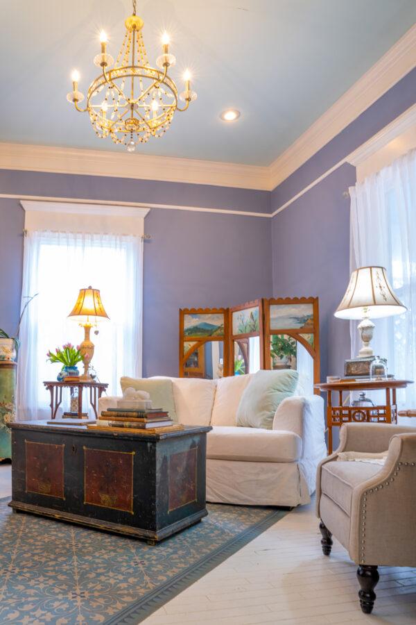
The living room features a Victorian hand-painted folding screen that dates to around 1876. (David Hatfield)

Over the years, the Berrys have accumulated an almost encyclopedic knowledge of how different period styles of mantles, staircase spindles, woodwork, and other elements look.

Twenty years ago, they would go to their local library to find resources on microfilm. Today, much of the information is available on the internet.

They’re excited that a new generation will carry the torch.

“That’s the most exciting thing to me, when somebody says, ‘I never thought I could do this. I’ve been so afraid of this. I thought it was out of reach either emotionally or financially. Watching you guys, I realize this is doable for me,’” Laine said.